
What you will learn:
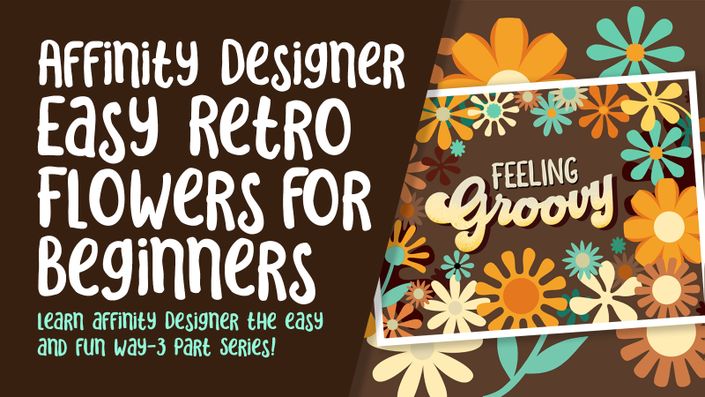
This Affinity Designer Typographic Layout class is the second in a 3 part series to introduce you to the Affinity Designer software. We created a bunch of retro flowers in the last class and arranged them into an attractive “frame”. Now we are ready to add the typography. Of course, I am going to tie in a lot of tips and tricks to make it interesting for you. And, this class, Affinity Designer Typographic Layout, will show you how to add not only one, but two thick outlines. We will use the Typographic AND the Appearance Studios. My third objective for this class was to show you the Pixel Persona. We will add a complementary texture to the lettering while in this persona. Then, I will also show you how to add texture to a symbol.
I take you from start to finish in finalizing this great layout in this class. The cool thing is that we use the symbols library we created in the first class. I want to show you how helpful it is to have those symbols and what happens when we alter one.
In this class I’ll walk you through:
- my step-by-step method for setting type in Affinity Designer
- tips for shaping the line of text by creating text on a path that we will draw with a pen or pencil
- why the Appearance Studio is so important
- adjusting symbols and adding texture while in the Pixel Persona
- moving points and using the handles to re-shape the line of text
Learning vector software can be a challenge, but my step-by-step will guide you through the tricky bits. This class will benefit anyone looking to round out their graphic design skills to go beyond raster based programs.
The key concepts I will include:
- introduction of the Pixel Persona in the Affinity Designer Program
- a look at how strokes can be used in typography
- the Appearance Studio and how it can help you be more efficient
Learning another set of functions in Affinity Designer is a plus, even if you are not sure what you will use the vector art! Learning vector software workflows is will open new doors for you. Vector programs are important for you to learn, and we will do it, step-by-step.
The key concepts I will include:
- review of basic tools in the Affinity Designer Program
- a look strokes and paths and how they are adjusted
- approaches you can take in learning this deeply powerful program
This is an fun and simplified class for you, even if you are not sure what you will use the vector art for, whether it be for surface pattern design, typography or whatever! Learning vector software workflows is always desirable. I think you will soon see why vector programs are important for you to learn.
Concepts covered:
Concepts covered include but are not limited to Affinity Designer type studio, Affinity Designer Pixel Persona, Affinity Designer Vector Persona, layering, Affinity Designer Symbol Studio, Affinity Designer canvas settings, Affinity Designer geometry tools, the pencil tool in Affinity Designer, stroke and fill in Affinity Designer, adjusting strokes, Boolean functions, compound shapes, workflow best practices, Affinity Designer composites, Affinity Designer Color Studio, Affinity Designer Assets Studio, Affinity Designer FX Studio, the art text and frame text tools in Affinity Designer, color swatches and importing colors, texture fills, and much more.
The Curriculum
- Intro to Typographic Design in Affinity Designer (1:26)
- Lesson 1 Overview, Installing Type and Inspiration (7:50)
- Lesson 2 General Typographic Overview in Affinity (7:38)
- Lesson 3 Typographic Terms and Adjustments (9:15)
- Lesson 4 Creating and Applying a Style in Affinity (8:24)
- Lesson 5 Using FX, Assets and Symbols (7:34)
- Lesson 6 Using the Pixel Persona for Texture (14:47)
- Lesson 7 Conclusion and Wrap Up (1:35)

